Build better forms in Ionic with autocomplete, helper text, and error messages
Today you’ll learn 4 tips on how to build better forms for our users with Ionic Framework.
For this example we’ll use a regular ReactiveForm built with Angular and Ionic.
<form [formGroup]="addContact" (submit)="saveContact()" novalidate>
  <ion-item fill="outline" class="ion-no-padding">
    <ion-label position="floating">First Name:</ion-label>
    <ion-input formControlName="name" type="text"></ion-input>
  </ion-item>

  <ion-item fill="outline" class="ion-no-padding">
    <ion-label position="floating">Last Name:</ion-label>
    <ion-input formControlName="lastName" type="text"> </ion-input>
  </ion-item>

  <ion-item fill="outline" class="ion-no-padding">
    <ion-label position="floating">Email:</ion-label>
    <ion-input formControlName="email" type="text"> </ion-input>
  </ion-item>

  <ion-item fill="outline" class="ion-no-padding">
    <ion-label position="floating">Phone Number:</ion-label>
    <ion-input formControlName="phone" type="text"> </ion-input>
  </ion-item>

  <ion-button type="submit" expand="block" fill="solid">Save Contact</ion-button>
</form>
The form has 4 fields, and right now they have no validation, they’re all text fields.
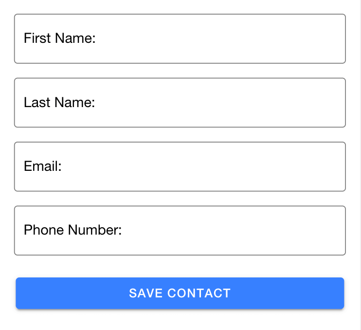
You can find the full source code for this application hosted at Github
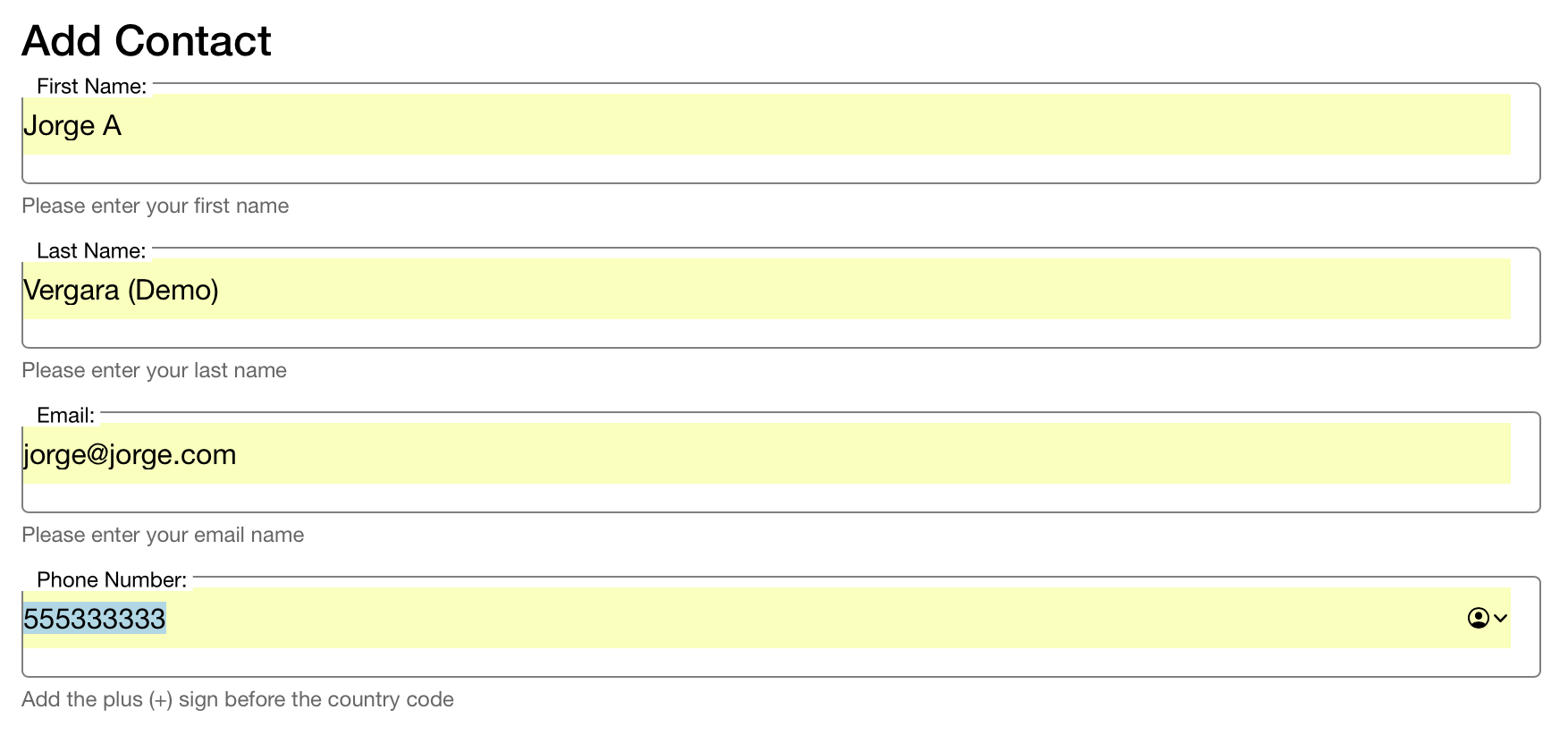
Helper Text
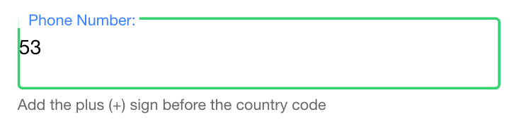
The first tip is to add helper text to our fields, the first 3 fields are self-explanatory, but the phone number could use a bit of extra information, does it take international format? Do I add the + sign myself? etc.
For this, we can add a component called <ion-note> with a slot of helper to our phone number
item:
<ion-item fill="outline" class="ion-no-padding">
  <ion-label position="floating">Phone Number:</ion-label>
  <ion-input formControlName="phone" type="text"> </ion-input>
  <ion-note slot="helper">Add the plus (+) sign before the country code</ion-note>
</ion-item>
It will show a small message in the bottom of the field when the user starts typing:
Descriptive Error Messages
All of the fields on our form are required, and the email field should be a valid email, but we’re not showing that to the user.
For that, we can use the same <ion-note> component but this time with a slot of error:
<form [formGroup]="addContact" (submit)="saveContact()" novalidate>
  <ion-item fill="outline" class="ion-no-padding">
    <ion-label position="floating">First Name:</ion-label>
    <ion-input formControlName="name" type="text"> </ion-input>
    <ion-note slot="helper">Please enter your first name</ion-note>
    <ion-note slot="error">Your first name is required.</ion-note>
  </ion-item>

  <ion-item fill="outline" class="ion-no-padding">
    <ion-label position="floating">Last Name:</ion-label>
    <ion-input formControlName="lastName" type="text"> </ion-input>
    <ion-note slot="helper">Please enter your last name</ion-note>
    <ion-note slot="error">Your last name is required.</ion-note>
  </ion-item>

  <ion-item fill="outline" class="ion-no-padding">
    <ion-label position="floating">Email:</ion-label>
    <ion-input formControlName="email" type="text"> </ion-input>
    <ion-note slot="helper">Please enter your email name</ion-note>
    <ion-note slot="error">You need to enter a valid email.</ion-note>
  </ion-item>

  <ion-item fill="outline" class="ion-no-padding">
    <ion-label position="floating">Phone Number:</ion-label>
    <ion-input formControlName="phone" type="text"> </ion-input>
    <ion-note slot="helper">Add the plus (+) sign before the country code</ion-note>
    <ion-note slot="error">You need to enter a valid phone number.</ion-note>
  </ion-item>
</form>
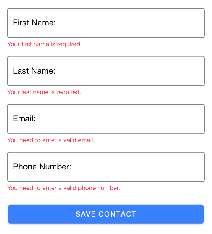
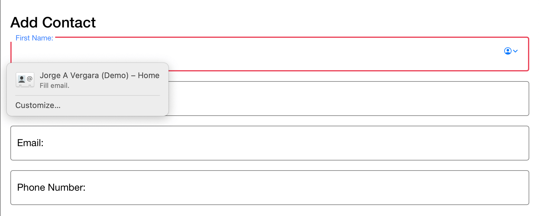
With this note the form will show errors to users on load, as seen in the picture below, which is truly hostile form design, we shouldn’t be displaying a bunch of red error messages to our users when they haven’t even interacted with our forms.
For that, we can improve our forms a bit by adding a conditional to the errors, and only show them if 1) the field is invalid, and 2) the field has already been touched and lost focus.
This way we’ll show the error only when the the user left that field without properly filling it.
<form [formGroup]="addContact" (submit)="saveContact()" novalidate>
  <ion-item fill="outline" class="ion-no-padding">
    <ion-label position="floating">First Name:</ion-label>
    <ion-input formControlName="name" type="text"> </ion-input>
    <ion-note
      slot="helper"
      *ngIf="!addContact.controls.name.valid && addContact.controls.name.touched"
      >Please enter your first name</ion-note
    >
    <ion-note slot="error">Your first name is required.</ion-note>
  </ion-item>

  <ion-item fill="outline" class="ion-no-padding">
    <ion-label position="floating">Last Name:</ion-label>
    <ion-input formControlName="lastName" type="text"> </ion-input>
    <ion-note
      slot="helper"
      *ngIf="!addContact.controls.lastName.valid && addContact.controls.lastName.touched"
      >Please enter your last name</ion-note
    >
    <ion-note slot="error">Your last name is required.</ion-note>
  </ion-item>

  <ion-item fill="outline" class="ion-no-padding">
    <ion-label position="floating">Email:</ion-label>
    <ion-input formControlName="email" type="text"> </ion-input>
    <ion-note
      slot="helper"
      *ngIf="!addContact.controls.email.valid && addContact.controls.email.touched"
      >Please enter your email name</ion-note
    >
    <ion-note slot="error">You need to enter a valid email.</ion-note>
  </ion-item>

  <ion-item fill="outline" class="ion-no-padding">
    <ion-label position="floating">Phone Number:</ion-label>
    <ion-input formControlName="phone" type="text"> </ion-input>
    <ion-note
      slot="helper"
      *ngIf="!addContact.controls.phone.valid && addContact.controls.phone.touched"
      >Add the plus (+) sign before the country code</ion-note
    >
    <ion-note slot="error">You need to enter a valid phone number.</ion-note>
  </ion-item>
</form>
Display the best keyboard for the job
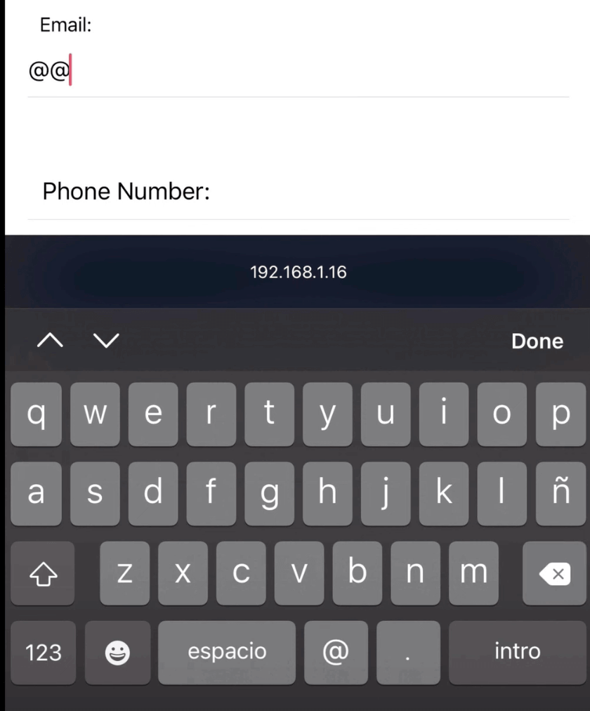
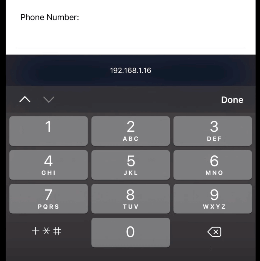
The third tip is to make things easier for our users by displaying the best keyboard for the job.
If you look closely at the form, you’ll see that all the inputs are type="text which makes the
browser on mobile open the generic text keyboard.
We’re going to go ahead and change the type on both the email field and the phone number field:
<ion-input formControlName="email" type="email"> </ion-input>
<ion-input formControlName="phone" type="text"> </ion-input>
And when you save, if you open the page with your mobile phone, you’ll see that by focusing the email or the phone number fields the phone will open the email keyboard (the one with the @ sign and the .com in some phones) or the numeric keypad.
Using browser autocomplete
And the fourth and final tip, don’t make your users do extra work.
Lots of poeple have their details stored in their browsers, this enables browsers to autofill forms for them, we can take advantage of this functionality to build better forms for our users.
By default, the browser tries to guess which information it can fill in a certain field with the
name property of the input, but it’s not that good at guessing, so it’s better if we’re explicit
about it by adding the autocomplete property.
You can see the entire list of autocomplete options in the Ionic Framework official docs, for our use case, we’ll add these four:
<form [formGroup]="addContact" (submit)="saveContact()" novalidate>
  <ion-item fill="outline" class="ion-no-padding">
    <ion-label position="floating">First Name:</ion-label>
    <ion-input formControlName="name" type="text" autocomplete="given-name"> </ion-input>
    <ion-note
      slot="helper"
      *ngIf="!addContact.controls.name.valid && addContact.controls.name.touched"
      >Please enter your first name</ion-note
    >
    <ion-note slot="error">Your first name is required.</ion-note>
  </ion-item>

  <ion-item fill="outline" class="ion-no-padding">
    <ion-label position="floating">Last Name:</ion-label>
    <ion-input formControlName="lastName" type="text" autocomplete="family-name"> </ion-input>
    <ion-note
      slot="helper"
      *ngIf="!addContact.controls.lastName.valid && addContact.controls.lastName.touched"
      >Please enter your last name</ion-note
    >
    <ion-note slot="error">Your last name is required.</ion-note>
  </ion-item>

  <ion-item fill="outline" class="ion-no-padding">
    <ion-label position="floating">Email:</ion-label>
    <ion-input formControlName="email" type="email" autocomplete="email"> </ion-input>
    <ion-note
      slot="helper"
      *ngIf="!addContact.controls.email.valid && addContact.controls.email.touched"
      >Please enter your email name</ion-note
    >
    <ion-note slot="error">You need to enter a valid email.</ion-note>
  </ion-item>

  <ion-item fill="outline" class="ion-no-padding">
    <ion-label position="floating">Phone Number:</ion-label>
    <ion-input formControlName="phone" type="tel" autocomplete="tel"> </ion-input>
    <ion-note
      slot="helper"
      *ngIf="!addContact.controls.phone.valid && addContact.controls.phone.touched"
      >Add the plus (+) sign before the country code</ion-note
    >
    <ion-note slot="error">You need to enter a valid phone number.</ion-note>
  </ion-item>
</form>
With that, it will display the autocomplete prompt (depending on your browser settings) and fill all the forms for you.
And that’s it, use this tips to make your users experience better when filling out forms, and if you think there’s an additional tip I should know about do let me know, you can tweet at me @javebratt and I’ll be happy to talk :-)